Cross-selling optimisation
Company: strato.de
The challenge
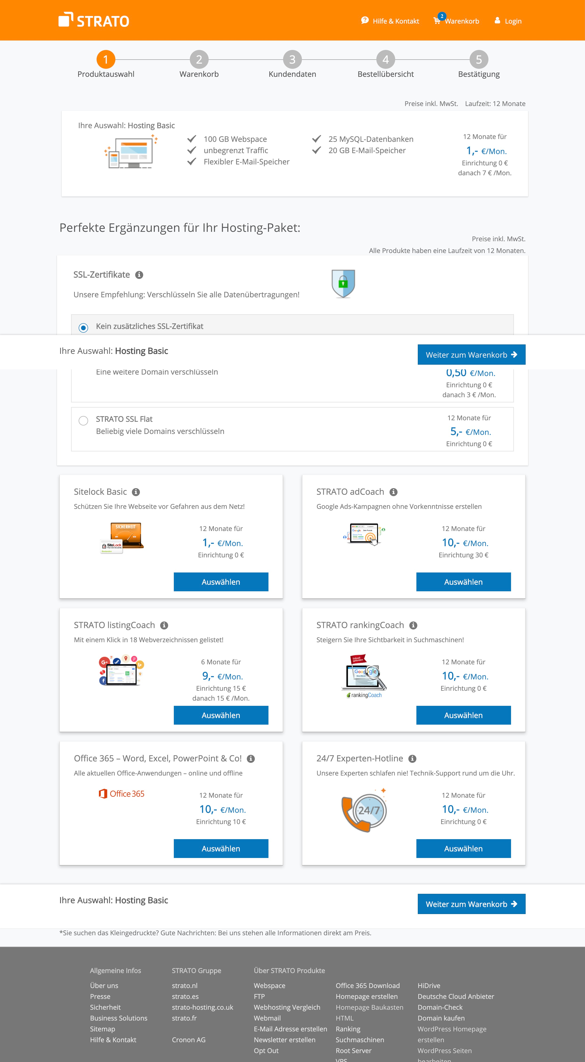
A very long cross-selling page with high information density is part of the checkout process. The only way for users to continue to the next step is to scroll the page to the bottom. Many of the users decide to leave the website at this point, without completing the order.
Project background
In the past an A/B test of this page against an optimised version was done, but it led to less sales. Right after this test, the page was switched back to the original and some of the stakeholders became more skeptical towards change.
The outcome
The final redesign of the cross-selling page - "after" - performed better on both KPIs (conversion rate and exit rate), doubling the percentage of users who bought at least one additional product.
Before and after
My role
As the only designer in the project my role was to suggest a timeline and goals for the redesign, organise regular meetings with the involved stakeholders, conduct research and redesign. I was working closely with data analysts and product managers.
Design Approach
The design process in this case was not only focused on user and business goals, but also on creating consensus between stakeholders. Therefore the process included the following steps:
- usability test of the complete checkout process ↓
- redesign of the cross-selling, based on findings from the usability test ↓
- prototyping the new design solution ↓
- usability test of the redesigned page and optimisation of the design, based on findings from the usability test ↓
- A/B test comparing the two different versions of the cross-selling ↓
Step 1 → Usability Test
The checkout flow for the hosting product is the most used user flow of the website. Nevertheless no preexisting research on it was available.
A remote usability test was conducted, with the goal of evaluating the usability of the checkout process in general and of the cross-selling page in particular.
Findings from the usability test:
- positive: the presence of the cross-selling page at this point of the checkout process was conforming to user expectations
- negative: some users were irritated by the long page
- negative: not all users recognised how to add a product to the cart
Step 2 → Redesign
The redesign of the cross-selling template was informed by the findings from the usability test. The goals for the redesign were to:
- give a better overview of the available products
- improve the interaction for the selection of products
- give the users a faster way to continue to the next step
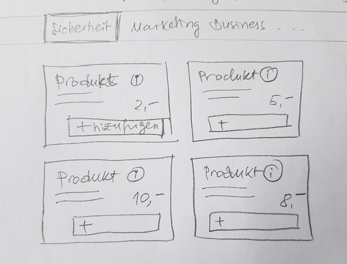
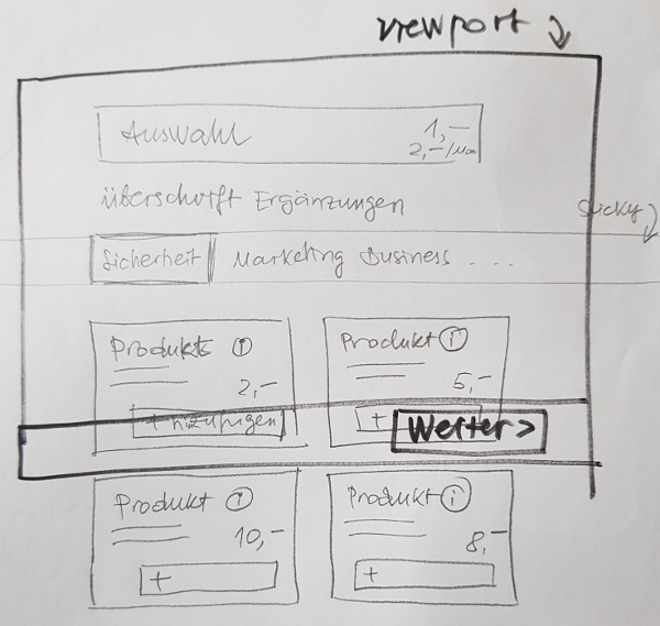
Sketches for desktop
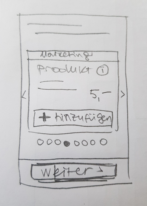
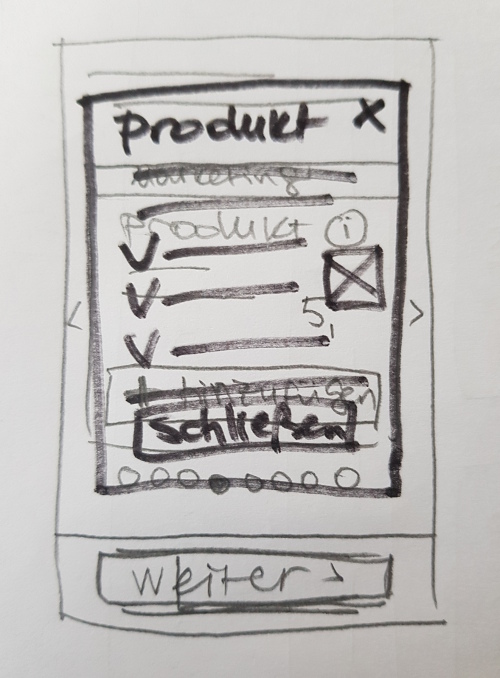
Sketches for mobile
After creating a couple of improved versions of the page, I organised a workshop with product managers, web analysts and developers in order to discuss the possible solutions. These were presented as low fidelity wireframes in order to be able to concentrate on the information architecture, without being distracted by design.
Following the workshop, I created mockups for the page integrating feedback from stakeholders.
Before: not selected state

Before: selected state

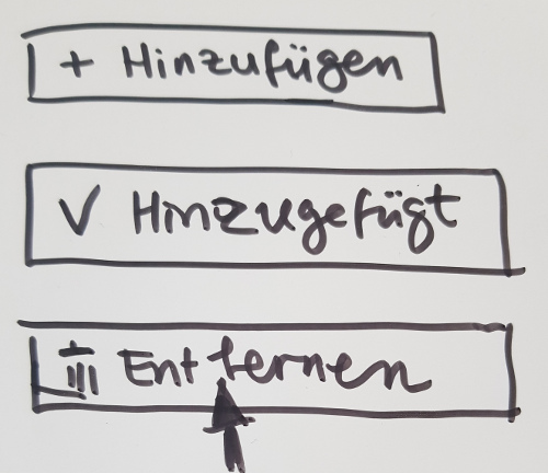
Sketches for multi-state buttons
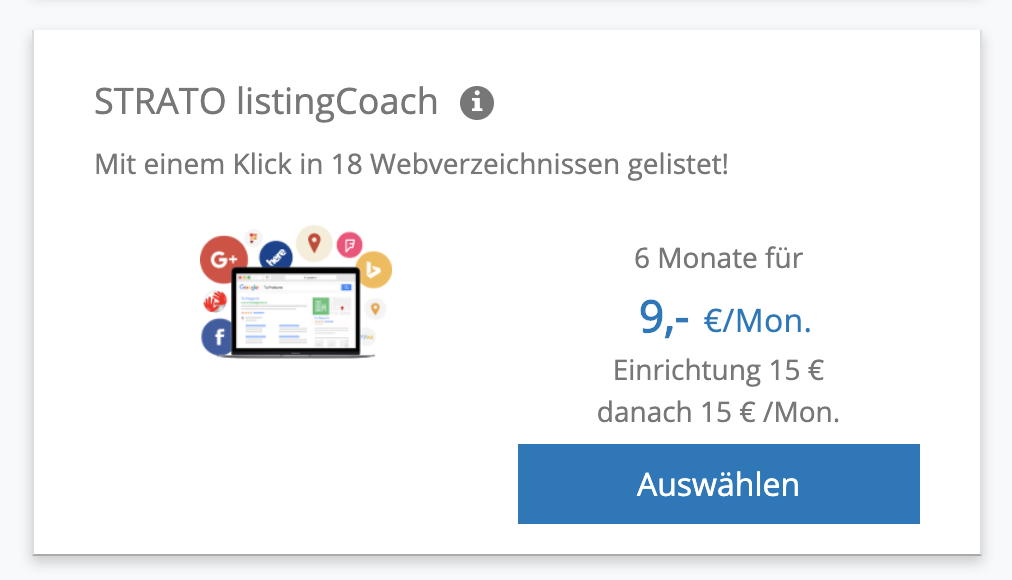
After: not selected state
After: selected state
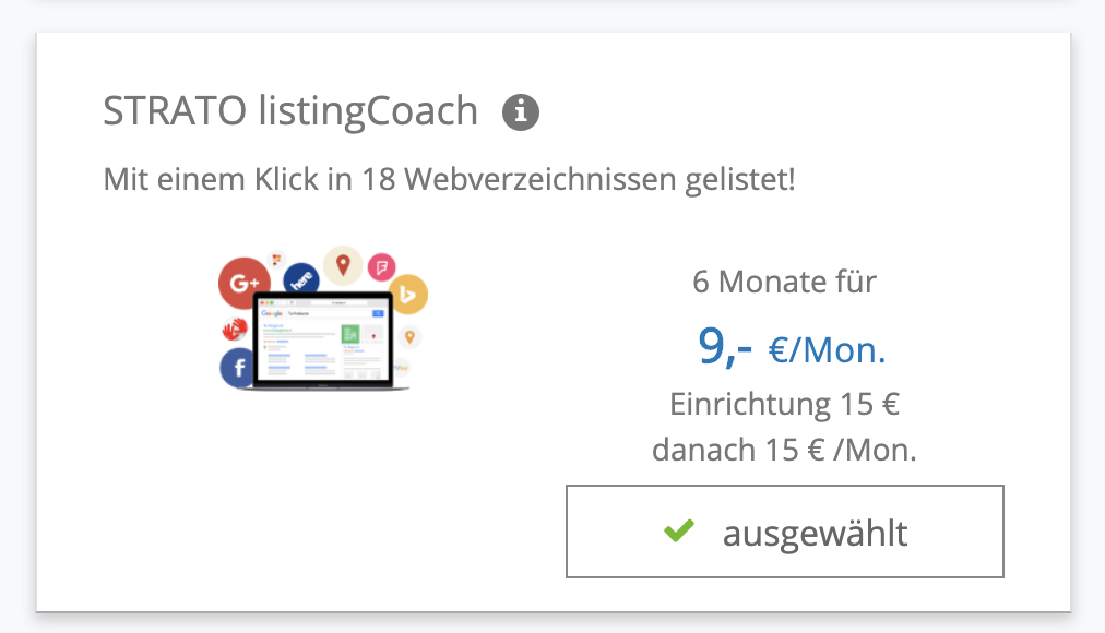
The redesign presents only the small amount of data necessary for the users to understand if they are interested in the product.
Step 3 → Prototype creation
After deciding on a final version for the cross-selling, I created a high fidelity prototype with Axure, that could be used in a remote usability test.
The prototype was first tested by a couple of colleagues that volunteered in order to make sure that there were no technical problems.
Step 4 → Usability test
The goals of the test was to observe user behaviour in a "5-minutes" remote test. This type of test is appropriate for studies that focus only on one main task.
Goals
The goals of the test were to observe if users will:
- scroll down the page, when there is a sticky bar with a "continue" button
- use the categories sub navigation to move between categories like "marketing" or "business"
- notice the category labels like "marketing"
- use the "select" button
- use the "info" button
- be frustrated because of the lack of information about the products
Observations
Observations from the usability test:
- all the users explored the content of the page
- none of them commented on the category labels or used the categories subnavigation, so these were removed in the final version
- most of them used the "select" button
- most of them commented on the info button and some of them also used it and commented positively on the additional information shown
- none of them expressed frustration
After removing all unnecessary elements, there was only one final step to be done - to verify if the new solution was better or worse for the business.
Step 5 → A/B test
The old and the new versions of the cross-selling were tested against each other, splitting the traffic 50/50 and considering the following KPIs:
- Conversion rate
- Take rate
- Exit rate
We could observe an improvement of all KPIs. The percentage of customers who bought at least one product on this page - also known as take rate - doubled from 7% to 14%.
Learnings
Design methods give a lot of possibilities to create consensus between stakeholders and facilitate decisions with the support of qualitative and quantitative data. The whole project involved a lot of quick iterations and collaborations and was perceived as a success by the participants.

